Preserved Sound’s community of artists responds to COVID-19
Invisible is an album of original pieces written and recorded as blind collaborations in lockdown by 11 Preserved Sound artists.

Invisible is an album of original pieces written and recorded as blind collaborations in lockdown as a response to the COVID-19 crisis by 11 Preserved Sound artists across Europe, North America and Australia: Aaron Martin, Adrian Lane, Ales Tsurko, Benjamin Louis Brody, Cédric Dind-Lavoie, Glacis, Neal Heppleston, Tess Said So, Thomas Méreur, Trigg & Gusset and Visionary Hours. The album was mastered by Ian Hawgood.
Each artist recorded a basic track. This was sent to three different artists, who recorded overdubs without hearing what the other artists had recorded. The overdubs were then sent back to the original artist to mix the finished piece.
The title Invisible not only refers to the concept that the COVID virus can’t be seen, but also that contributing artists collaborated on the pieces blindly without hearing what another artist had recorded or without having ever met. The album showcases the combined response of Preserved Sound’s community of artists to COVID-19 – with the individual pieces coalescing to create a cohesive whole.
All proceeds of the sale of Invisible will go to support children affected by COVID-19 across the developing world via the charity Mary’s Meals. The album costs £7.95 – this is the price Mary’s Meals is able to feed a child for half a year. With the UK government doubling donations until January 31, 2021, each album sale will essentially feed a child in the developing world for an entire year.
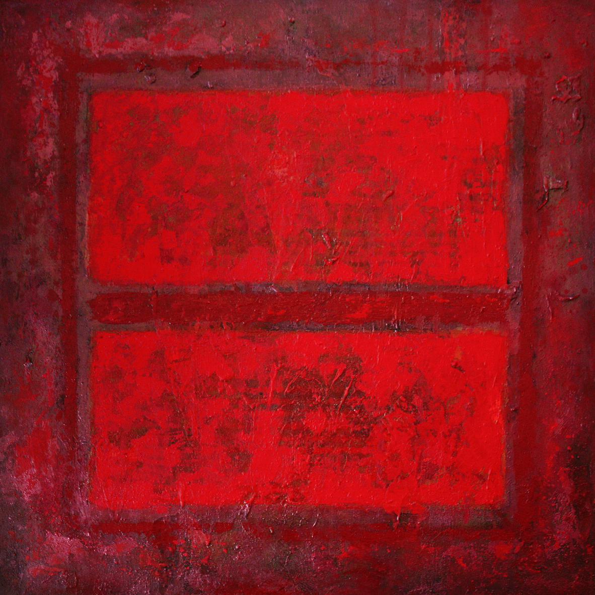
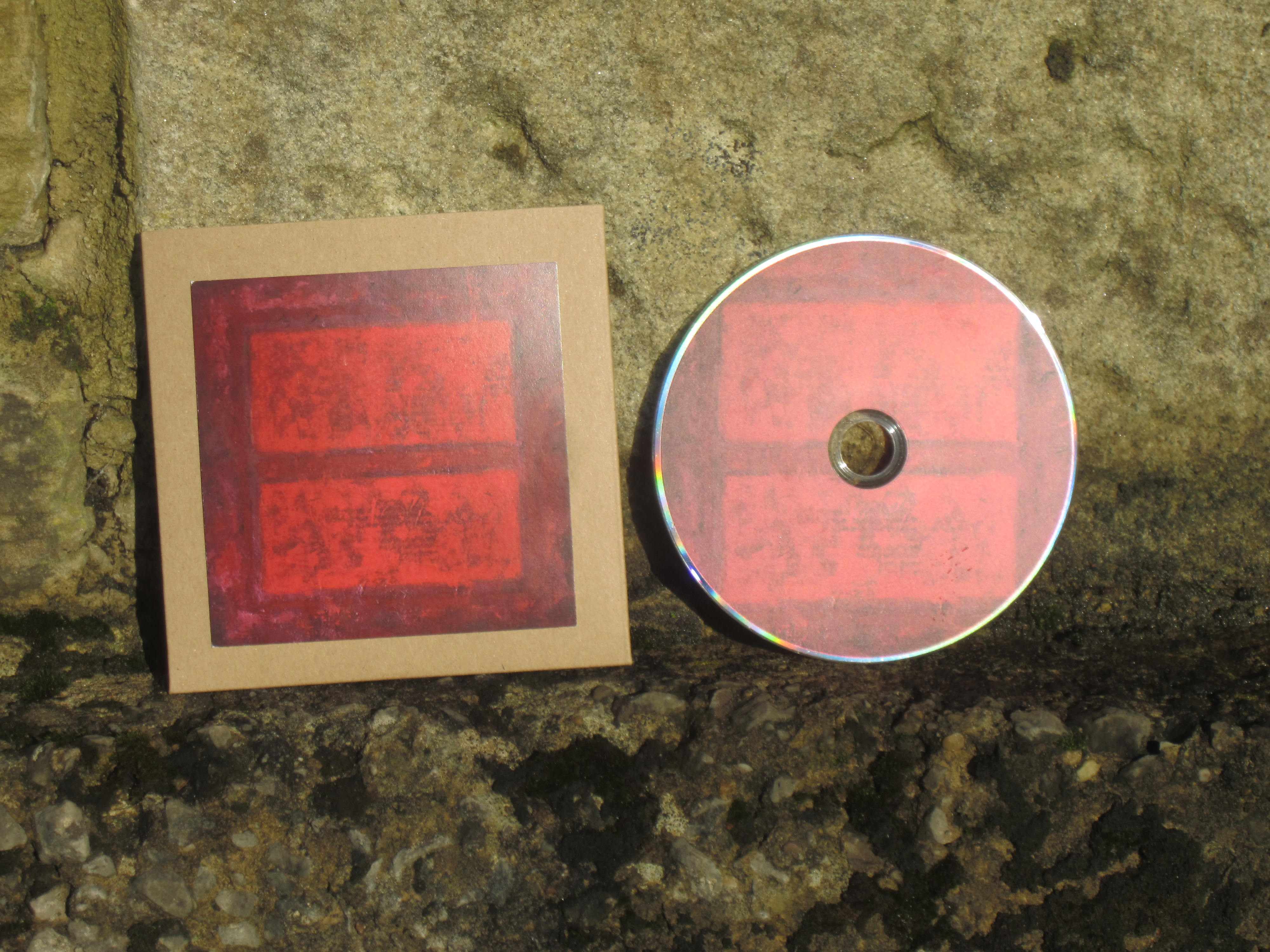
The cover was painted by Adrian Lane, who writes: "The piece is very much inspired by the work of Mark Rothko, and was a homage to him created specifically for Invisible. The basic idea of rectangular forms and limited colour range are taken from Rothko but the application of paint, and use of mixed media is very much my own. The painting is built up from many layers of mixed media, with collage elements, a variety of different types of paint and acrylic texture gels. Producing the painting specifically for the album cover meant that I could try something different to what I usually do; and the use of colour particularly is very different to my usual work. The central shapes could be seen as an ‘=’ sign, and turned on its side becomes a ‘pause’ symbol, which is pretty appropriate for the times we are living in."
 |  |
